Reaction on Facebook mixed
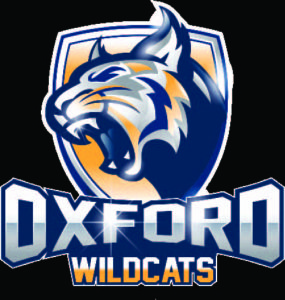
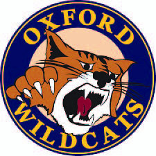
A new logo to represent high school athletics was unveiled by Oxford Community Schools on Aug. 2, but that doesn’t mean the circular Wildcat logo that people are familiar with is being scrapped. It will still be used at other levels within the district.
“It’s just an additional logo,” said Athletic Director Jordan Ackerman. “We’re not getting rid of anything . . . This isn’t a replacement. This is just another logo that our coaches can use.”

The new Wildcat logo offers a look and feel that’s “more modern” and “more competitive,” according to Ackerman.
Matt Johnson, the district’s director of marketing and communications, echoed Ackerman’s statements about the old and new logos.
“(The new one is) an ancillary logo to help us. It’s not replacing anything,” he said.
By “ancillary,” Johnson means “it can be used, but it’s not (the) primary (logo).”
“The only primary logo in the district is our triangle,” he noted. Within that triangle are the words “Oxford Community Schools” and three various-sized ‘Os.’ Below it is the district’s motto, “Where the globe is our campus.”
Why the new logo?
“We really are just trying to provide a different and newer look for the kids, something they can go out there and feel confident (wearing on hats and uniforms), something they can be proud of,” Ackerman said.
Johnson said the new logo offers the athletics department and sports teams an option that’s “more contemporary” in appearance and more easily and readily identifiable as representing Oxford than the block ‘O,’ another logo frequently used within the district. He explained the ‘O’ isn’t automatically and universally recognized as Oxford.
“We could be Ohio. We could be lots of other things,” Johnson said. “What does the ‘O’ represent? Obviously, it represents Oxford, but not once you leave Oxford.”
Johnson noted that “for some reason,” as the years went by and staff and leadership changed within the district, the circular Wildcat logo stopped being the go-to symbol for high school athletics.
“We really haven’t been using (that) one that much,” he said.
Coaches and students who saw the new logo “love it,” according to Ackerman.
“In person, we’ve received nothing but positive feedback,” he said.
When the new logo was unveiled at the annual meeting of all high school and middle school coaches, held Aug. 2, Johnson described the overall reaction as “very positive.”
“Everybody liked it,” he said. “They thought they could identify with it, (that the design) had a lot of professionalism.”
Superintendent Tim Throne is “excited” about the new logo.
“It will be cool and fun to have another logo at our disposal,” he said.
Throne described the new logo as “aggressive, but not crazy” and “modern,” but with a feel that’s “still traditional.”
“To me, it pops,” he noted.
Like Ackerman and Johnson, Throne stressed the district is “not doing away with” either the circular Wildcat logo or the block ‘O.’
“We’re just adding to (the options available),” he said.
The choice is theirs
Ackerman indicated it will be up to each coach to decide whether he or she wants to incorporate the new logo into their team’s look.
“It’s just an additional logo they can use,” he said. “Some will stick with the (block) ‘O’ and that’s perfectly fine.”
But, based on the feedback he’s received, Ackerman believes a number of coaches will want to take advantage of the new logo.
“Oh, yeah. Absolutely. I guarantee they (will),” he said. “They’re pumped about it. They’re excited to use it.”
What are folks saying on social media?
On the district’s Facebook page, public reaction to the new logo was mixed.
“This is absolutely awesome! I love (the) change! Good job, guys!!” wrote LaWanda Persuasion.
“Saddened they would change our beloved Wildcat to some computer image that just looks terrible and (is) not at all fitting the spirit we have all grown to love in our lives,” wrote Jessica Gross-Fultz.
“Great update!! Love the new logo! Can’t wait to get some gear with that on it!!” wrote Nate Billings.
“I’ll stick (with) the old one . . . Hard NO for this 1990 (alum),” wrote Joe Bice.
“Don’t be afraid of change . . . change is a good thing! LOVE IT!!!,” wrote Becky Hubbel Boreo.
“Once a Wildcat, always a Wildcat! But that is not a Wildcat! Not a fan of the change!” wrote Catherine Roop Grant.
“Looks so much better (than) the old one,” wrote Mackenzie Rivera.
“That’s super ugly. Rethink your choices, Oxford. Don’t slum it,” wrote Samantha Smith.
Chiming it with “Love it!” were Candice DeLuca, Michelle Klein, Gayle Jaranilla-Bailey and Shelly Bouren.
“Sorry. Looks like a robo-cat. I am not in love with it. Still better than a Dragon . . . lol,” wrote Donna Downs Enyart.
“That looks great!” wrote Rolando De La Rosa.
“Why not keep the tried and true? It was great and meant a lot to past graduates?” wrote Cheryl Buckland Dolmage.
“I don’t like that everyone is being so mean about this . . . logos get changed from time to time. I love the new Wildcat and I think it was a great idea!” wrote Caterina Ann.
“Looks weak. Could have done better (than) this. Our cat looks Scrawny,” wrote Nicole Jon Mitchell.
Kittie Pugliese called the new logo, “Fierce.”
“Liked the old one! Sometimes the old way is the BEST WAY!” wrote Linda Vesey-Heller.
“Awful. Just awful. All flash, no class. Hard boo,” wrote Justin W. Law.
But, not everyone was passionate either way.
“We’re THIS upset over a logo . . . are we kidding?” wrote Serenity Grant.
The reactions on social media didn’t surprise Ackerman and Johnson.
“With any decision you make, a third of the people are going to love it, a third of the people are going to hate it and a third of the people just don’t care either way,” Ackerman said.
“There’s haters, there’s lovers,” Johnson said. “With any change, there’s always feedback that you’ve got to just sort out.”
What’s happening with the traditional logo?
The well-known circular Wildcat logo will continue to represent the elementary and middle school levels along with middle school athletics, according to the district’s brand usage guide and Johnson.

“Nothing’s going away,” Johnson said.
“I feel very strongly about preserving tradition,” Ackerman noted. “One thing I made clear from the start of this process was we’re definitely not getting rid of any logos. Those are tied to the history of the school and we’re certainly not going to erase anything. The move was just to create an additional logo.”
Less than $60 was spent making the new logo
There were some questions and criticisms on social media regarding how much money was spent creating the new logo and the apparent use of a stock image.
According to Johnson, a piece of clipart – specifically, the cat image – was used “as a base to start” the process, “but then we made it ours” with some changes.
He said it cost the district $29 to purchase the rights from VectorStock.com, an online specialized stock agency, to use and reproduce the original cat image. A consultant was then paid $27 to assist with stylizing it.
Johnson doesn’t deny the stock cat image and the Wildcat in the new logo are “very similar,” but he said subtle changes were made with regard to “shape,” “direction,” the ears and the color gradient, all to ensure it looked like a Wildcat.
“It’s not a cougar. It’s not a lion,” he said.
To the Wildcat image, the district added embellishments such as the shield that frames it and the “Oxford Wildcats” lettering below it.
“We just stylized it (and) made it Oxford,” Johnson said.

Leave a Reply